Image Optimization for Web Performance: A Practical Guide
Introduction
Images are an essential part of modern web experiences, but they can also contribute significantly to page weight and loading time. High-resolution images, oversized assets, and inefficient delivery can increase network usage, delay content rendering, and affect the overall user experience.
The challenge isn't simply reducing image file sizes. It's delivering the right image dimensions and format, optimizing how images are loaded, and ensuring that critical visual content reaches users without unnecessary delays.
Image optimization plays an important role in improving Largest Contentful Paint (LCP), reducing page weight, and making websites more responsive across different devices and network conditions.
In this guide, we'll explore practical image optimization techniques, from choosing modern image formats and serving responsive images to prioritizing critical assets and measuring their impact on web performance.
Understanding Image Performance
Images can have a significant impact on how quickly a web page loads. Image assets can vary considerably in file size, dimensions, and compression. Serving unnecessarily large images increases the amount of data browsers need to download, potentially delaying the rendering of important content.
To understand where image optimization helps, it's important to consider three factors.
Image File Size
Image file size determines how much data the browser needs to download before an image can be displayed. Large, uncompressed images can consume considerable bandwidth, particularly on slower networks or mobile connections.
For example, consider a hero image that is 2MB in size. Reducing its dimensions and applying appropriate compression could significantly reduce its download size without a noticeable loss in visual quality.
Smaller image files generally mean less data transferred, faster downloads, and reduced bandwidth consumption.
Image Dimensions
Image dimensions determine the actual resolution of an image, typically measured in pixels.
Consider a website displaying an image within a container that is 600 pixels wide. Serving a 2400-pixel-wide image when that resolution isn't needed results in unnecessary data transfer.
The browser may scale the image down to fit the container, but this doesn't reduce the original file size or the amount of data downloaded.
Serving images close to their required rendered dimensions, while accounting for device pixel ratio, helps avoid unnecessary data transfer without compromising visual quality.
Impact on Page Loading and LCP
Large images can delay the rendering of important visual content, particularly when they appear above the fold.
The Largest Contentful Paint (LCP) metric measures how long it takes for the largest visible image or text block to render within the viewport. In many cases, this element is a hero image or a prominent banner.
If an LCP image is unnecessarily large, takes too long to download, or isn't prioritized correctly, it can increase the page's LCP time.
Optimizing image size, dimensions, and loading priority helps browsers deliver important visual content more efficiently.
Choosing the Right Image Format
Choosing the right image format helps reduce file sizes while maintaining visual quality. Different formats offer different compression capabilities, transparency support, and browser compatibility.
JPEG
JPEG uses lossy compression and works well for photographs and images with complex color variations. It offers good compression but doesn't support transparency. Excessive compression can introduce visible artifacts.
PNG
PNG uses lossless compression and supports transparency, making it suitable for logos, icons, and graphics with sharp edges. However, its file sizes can be considerably larger, particularly for photographs.
WebP
WebP supports both lossy and lossless compression, along with transparency and animation. It generally delivers smaller files than JPEG and PNG at comparable visual quality, making it a versatile choice for web images.
AVIF
AVIF offers efficient lossy and lossless compression, often achieving smaller file sizes than JPEG and WebP at comparable quality. It also supports transparency and HDR, although encoding can be more computationally expensive.
Choosing the Right Format
| Format | Best suited for |
|---|---|
| JPEG | Photographs |
| PNG | Graphics and transparency |
| WebP | General-purpose web images |
| AVIF | Highly optimized web images |
For modern websites, WebP and AVIF are strong choices, while JPEG and PNG remain useful for specific compatibility and content requirements.
Responsive Image Delivery
Serving the same image to every device can result in unnecessary data transfer. A large desktop image, for example, may be unnecessarily expensive to download on a mobile device.
HTML provides built-in mechanisms to deliver appropriately sized images without relying on JavaScript.
Using srcset and sizes
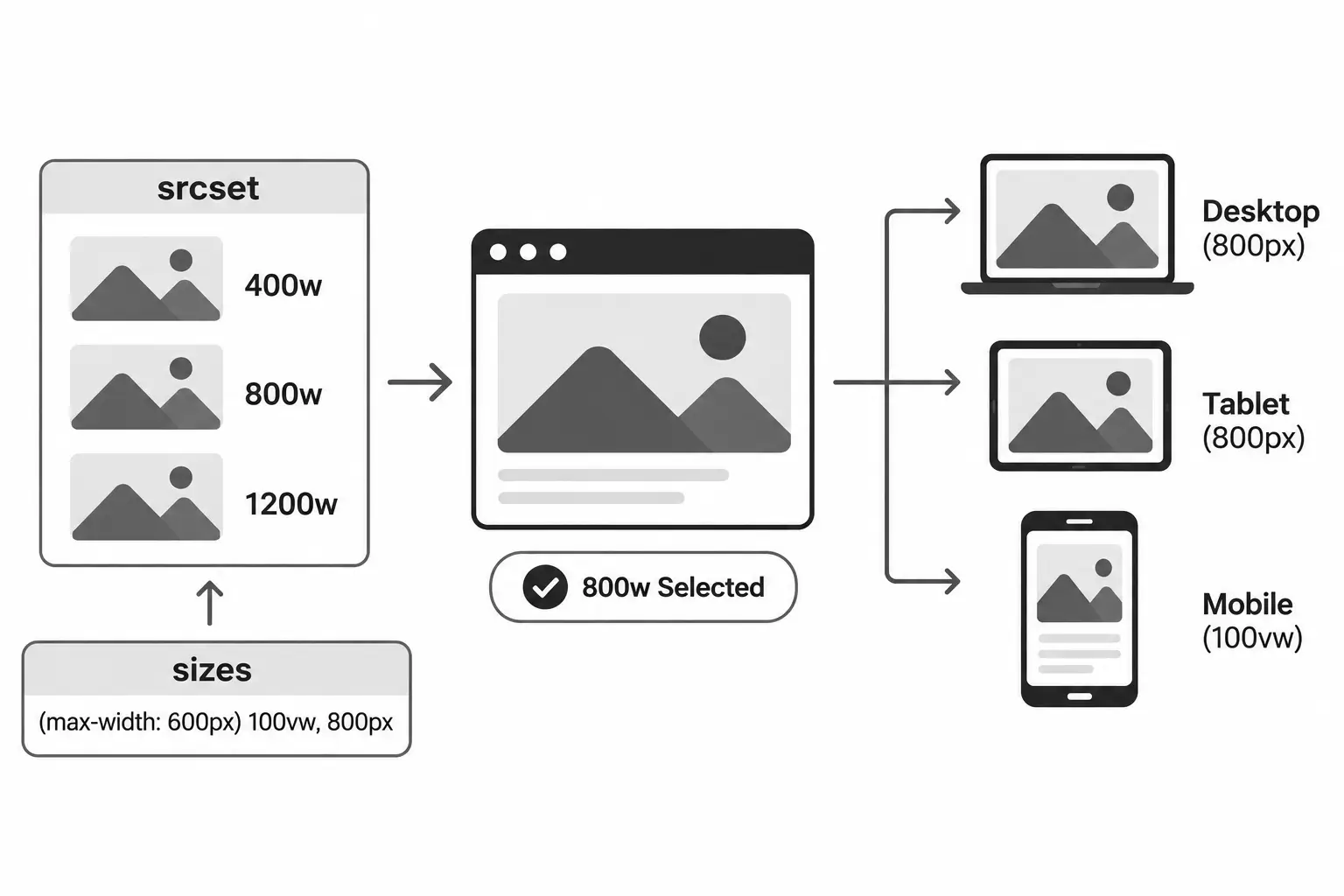
The srcset attribute allows developers to provide multiple image sources at different resolutions, giving browsers a choice based on the image's display requirements.
The sizes attribute describes the expected rendered width of the image at different viewport sizes. Together, these attributes help browsers select an appropriate image resource without downloading unnecessarily large assets.
<img
  src="image-800.webp"
  srcset="
    image-400.webp 400w,
    image-800.webp 800w,
    image-1200.webp 1200w
  "
  sizes="(max-width: 600px) 100vw, 800px"
  alt="Responsive landscape"
  width="800"
  height="600"
/>
Using the picture Element
The picture element allows developers to provide different image formats or image sources for specific conditions.
<picture>
  <source srcset="image.avif" type="image/avif" />
  <source srcset="image.webp" type="image/webp" />
  <img
    src="image.jpg"
    alt="Landscape"
    width="800"
    height="600"
  />
</picture>
This allows browsers to select a supported format, with the img element providing a fallback.
Optimizing Image Loading
Image optimization isn't limited to reducing file sizes. How and when images are loaded also affects page performance. Loading strategies help browsers manage image requests based on their visibility and importance.
Lazy Loading
The loading="lazy" attribute tells the browser to defer loading an image until it approaches the visible viewport. This reduces unnecessary network requests for images users may not immediately see.
<img
  src="gallery.webp"
  alt="Gallery image"
  width="800"
  height="600"
  loading="lazy"
/>
Eager Loading
Images use eager loading by default unless a different loading strategy is specified. Browsers can therefore discover and request these images without the intentional deferral introduced by native lazy loading.
For important above-the-fold images, including potential LCP elements, avoid applying loading="lazy" to prevent unnecessary loading delays.
Prioritizing Critical Images
The fetchpriority attribute provides a hint to the browser about the relative priority of a resource.
<img
  src="hero.webp"
  alt="Hero image"
  width="1600"
  height="900"
  fetchpriority="high"
/>
Use fetchpriority="high" selectively for important images, such as the LCP image, rather than applying it to every image.
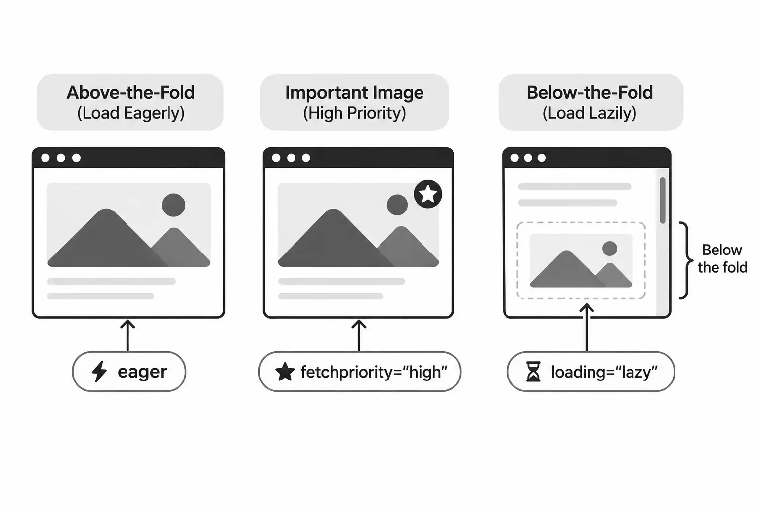
Image Compression and Delivery
Image compression reduces the amount of data required to deliver visual content without unnecessarily compromising quality. Combined with efficient delivery mechanisms, it helps reduce page weight and improve loading performance.
Lossy vs. Lossless Compression
- Lossy compression reduces file size by discarding some image data. It works well for photographs where minor quality differences are acceptable.
- Lossless compression reduces file size without losing image information. It's useful for graphics and assets where preserving exact details matters.
The appropriate compression level depends on the image content and the required visual quality.
Image CDNs and Transformations
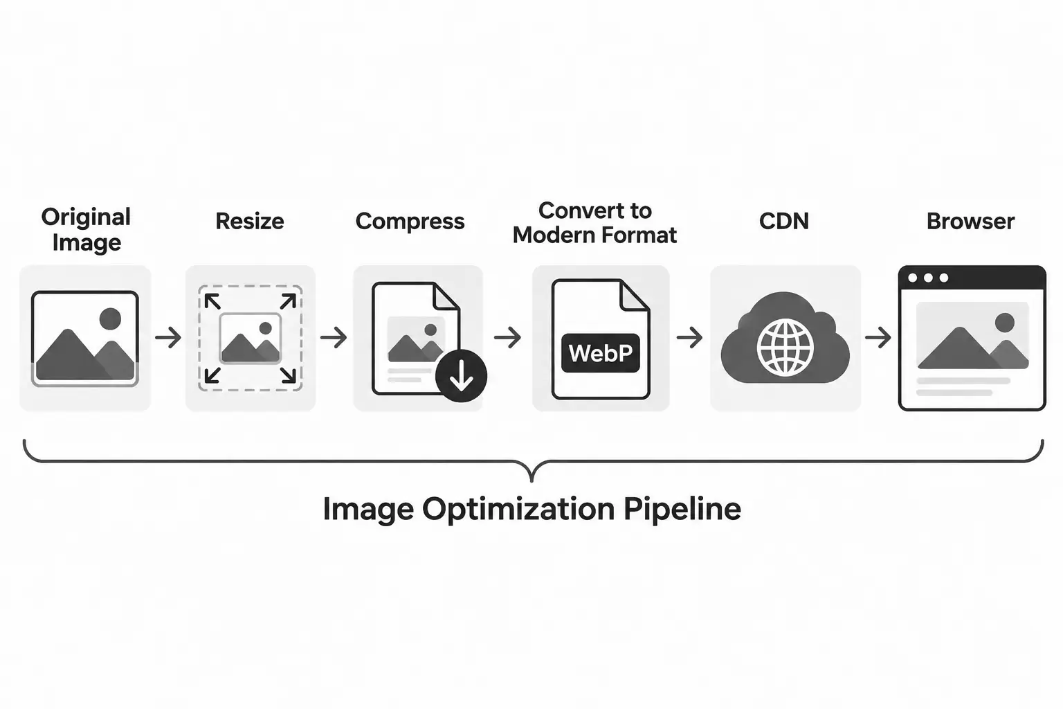
Image CDNs can optimize image delivery by resizing, compressing, and converting images based on request parameters. This avoids maintaining multiple manually optimized versions of every asset.
For example, an image service might generate a WebP version at a specific width:
https://example.com/image.jpg?width=800&format=webp
Automating Image Optimization
Image optimization can also be integrated into build pipelines using tools such as Sharp. This helps generate appropriately sized and compressed assets during the build process rather than relying on manual optimization.
Measuring Image Performance
Image optimization should be validated through actual performance measurements rather than file size reductions alone. Browser tools help identify inefficient image delivery and understand its impact on page loading.
Using Chrome DevTools
Chrome DevTools provides useful insights into image requests and their loading behavior.
- Network panel: Inspect image file sizes, transfer sizes, request timing, and loading duration.
- Performance panel: Analyze when images are requested and rendered, particularly the LCP element.
- Elements panel: Inspect image dimensions and compare intrinsic dimensions with rendered dimensions.
Using Lighthouse and PageSpeed Insights
Lighthouse identifies common image optimization opportunities, including:
- Properly sizing images.
- Serving images in modern formats.
- Efficiently encoding images.
- Deferring offscreen images.
PageSpeed Insights also provides field data from the Chrome User Experience Report (CrUX), when available, helping evaluate real-world performance.
Evaluating Improvements
Compare performance before and after optimization using consistent testing conditions. Look beyond reduced image sizes and evaluate metrics such as LCP, total page weight, and image loading behavior.
For image-based LCP elements, understanding the different loading phases helps identify where performance bottlenecks occur:
- Time to First Byte (TTFB): Time from navigation until the browser receives the first byte of the HTML response.
- Resource Load Delay: Time before the browser starts requesting the image.
- Resource Load Duration: Time taken to download the image.
- Element Render Delay: Time between the image finishing its download and being rendered.
Analyzing these phases helps determine whether an LCP issue is related to delayed image discovery, slow downloads, or delayed rendering.
For a deeper understanding of LCP and other Core Web Vitals metrics, read our Core Web Vitals guide.
Image Optimization Best Practices
Effective image optimization requires more than choosing a smaller file format. Consider the following practices when building and maintaining performant websites:
- Choose appropriate formats: Use WebP or AVIF where suitable, while retaining JPEG and PNG for specific requirements.
- Serve responsive images: Use
srcsetandsizesto deliver images that match the available display space. - Compress images: Apply appropriate compression without introducing noticeable quality degradation.
- Set image dimensions: Specify
widthandheightto help browsers reserve space and reduce layout shifts. - Lazy load offscreen images: Use
loading="lazy"for images that aren't immediately visible. - Prioritize critical images: Use
fetchpriority="high"selectively for important resources, particularly the LCP image. - Use image CDNs: Automate resizing, format conversion, and image delivery where appropriate.
- Measure performance: Regularly audit image loading and evaluate its impact on Core Web Vitals.
Consistently applying these practices helps reduce unnecessary image payloads, improve loading performance, and deliver better experiences across devices and network conditions.
Conclusion
Image optimization is an important part of building fast and responsive web experiences. Choosing appropriate formats, serving responsive assets, optimizing loading strategies, and applying efficient compression all contribute to better image delivery.
The goal isn't simply to deliver smaller images, but to deliver the right images at the right dimensions, quality, and time.
Regularly measuring the impact of these optimizations helps reduce unnecessary data transfer, improve Core Web Vitals, and deliver better experiences across devices and network conditions.
On this page
Author
Farhan Halai
Topics
Share